
PVC Clear Inner Bag — A Complete Product Guide Sizes · Materials · Manufacturing Process…
An entire spring, right on your desktop.
═══════════ HERO ═════════════════════════════════
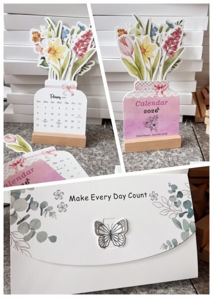
Some things, once placed at the corner of your desk, give the whole day a backdrop.
This floral desk calendar is exactly that kind of presence — not just sheets of paper clipped to a plastic stand, but rather a bouquet made of paper. A vase-shaped body, hand-painted watercolor florals, and a warm solid-wood base. From the moment you unwrap it, you’ll want to set it in the most visible spot on your desk — and leave it there all year.
01
Materials: attention you can see and touch
Materials: attention you can see and touch
For any desktop piece worth keeping, material quality is the first test. Let’s break this calendar down, layer by layer.
The Body — Heavyweight Coated Cardstock. The floral panel is printed on single-side coated white cardstock, 300 gsm and above, finished with a matte lamination. At this weight, the paper stands upright without the dreaded “sag” you get from ordinary calendars. Tap the surface with your fingertip — you’ll hear a crisp, solid snap, not the hollow rustle of flimsy paper. The matte lamination gives it a subtle silk-like sheen, protecting the artwork from scratches while making the floral colors feel richer and warmer.
The Base — Natural Beechwood. Most people’s first reaction when they pick up the base: “This feels a lot better than I expected.” And it should — it’s not lightweight composite board. It’s a single solid block of beechwood, roughly 8 mm thick. The grain is fine and even, with a natural light-oat color. The surface has a matte lacquer finish — smooth to the touch, but not slippery. And the weight matters: at roughly 120–150 g, this base doesn’t just sit still on your desk; it has the reassuring heft of a paperweight.
The Calendar Pages — 80 gsm Offset Paper. The inner pages use 80 gsm dual-coated offset paper, striking the right balance — any thinner and you’d get show-through; any thicker and flipping pages becomes a chore. Brightness is kept at around 82% (none of that harsh bleached-white glare), making it pleasant for daily reading. If you’re someone who jots quick notes on your calendar, a gel pen or pencil writes cleanly here with zero ink bleed.
Body Panel
300 gsm+ coated white card · matte lamination
Base Material
Natural beechwood · matte lacquer · ~8 mm thick
Inner Pages
80 gsm offset paper · 82% brightness · no ink bleed
Total Weight
~280–320 g · substantial and stable
02
Craftsmanship: where the invisible effort lives
Craftsmanship: where the invisible effort lives
Materials are the foundation — it’s the craftsmanship that separates the good from the great. This calendar packs quite a few “invisible investments” — details you won’t notice at first glance, but that make all the difference in daily use.
Die-Cutting Precision. The vase silhouette isn’t a simple straight cut — it’s an irregular die-cut with sweeping curves. The flower petals have uneven, organic edges, each contour requiring a dedicated steel-rule die. You can judge the cut quality just by looking: are the petal edges clean, with no burrs? Are there any uncut bridges or over-cut tears at the corners? This one passes: the cut lines are crisp and sharp, which tells you the die stayed sharp and the pressure was dialed in just right.
Slot-In Assembly Design. The “vase body” and the “floral top” are separate pieces that slide together — a pre-cut slot on the back of the main panel holds the upper floral piece. This keeps the structure stable while making it easy to disassemble and replace. The slot width has to be extremely precise: too tight, and the panel won’t go in, or worse, it scratches the print; too loose, and the bouquet wobbles. In hand, the fit is perfectly judged — you can slide it in with one hand, and once seated, it stays put through mild bumps.
Groove & Angle Engineering. The base groove is a rectangular recess milled into the beechwood block. Once the calendar body is inserted, it reclines at roughly a 70° backward angle — steep enough for clear vertical visibility, yet far enough back that the center of gravity won’t tip it forward. That angle wasn’t picked at random; it’s the result of actual structural calculation, not just “cut a slot and call it done.”
Watercolor-Style Digital Printing. The floral artwork uses a digital watercolor-style print process. Color transitions are soft and grain-free. Pay close attention to the gradient between the pink roses and the tiny purple blooms — it blends naturally, with no harsh banding. Print resolution exceeds 300 dpi; lean in close and you won’t see dot patterns. That’s the mark of high-end digital printing equipment, not run-of-the-mill offset.
“A great product doesn’t shout its quality at you. You just find yourself thinking — everything about this feels right. That’s what happens when every detail has been taken seriously.”
03
Hardness & Durability: a full year without letting you down
Hardness & Durability: a full year without letting you down
Too many paper-based creative products share the same flaw — they don’t survive a single season. Boards warp, prints fade, bases loosen… and before you know it, you’ve got a pile of crumpled scraps sitting where something beautiful used to be.
This calendar took durability seriously. Board stiffness is the key metric. At 300 gsm+, with lamination on top, both machine-direction and cross-direction stiffness reach high levels. In plain terms: when you hold it, it doesn’t feel like “a thin sheet.” It feels like a panel — solid, structural. The laminate layer isn’t just about texture; it’s a protective coat — moisture-resistant, scratch-resistant, UV-resistant. Desk surfaces getting damp during southern China’s rainy season? The laminate handles it; no wrinkling, no color bleeding from trapped humidity.
The beechwood base deserves a close look too. Beechwood has a Janka hardness rating of approximately 1,450 lbf — solidly in the mid-to-high range among common woods. It’s more than twice as hard as pine (690 lbf) and comparable to oak (around 1,360 lbf). In everyday language: this base is highly unlikely to pick up dents from regular knocks and bumps. The lacquer finish also repels tea stains and coffee rings — a quick wipe with a damp cloth and it’s clean again.
The binding method is twin-wire YO-ring binding, with nickel-plated metal rings that resist rust. You’ll flip through 365 days without a single jam or loose page. It’s the most basic quality requirement — but when it’s done right, you stop worrying and just enjoy using it.
In a single sentence: this isn’t one of those “buy it for New Year’s, toss it in March” throwaway calendars. It will walk with you through the entire year — and come next year, you may just decide to keep it in a corner as decor.
04
Scenes: who is it for, and where does it belong?
Scenes: who is it for, and where does it belong?
The worst way to present a product is to list its specs in a dry monotone. Specs are the skeleton — scenes are the flesh and blood. Here are six real-world places where this floral calendar comes alive.
🪴
Personal Desk
Next to your monitor, among the file stacks — a pot of “paper flowers” you never need to water. Glance up and see that soft blush-and-green palette; the workday tension eases, just a little.
🎁
Seasonal Gifting
Year-end, New Year’s, spring festivals — a calendar that “blooms” says more than a box of chocolates ever could. The elegant gift box makes unwrapping feel like an occasion.
☕
Café / Bookstore
The worst thing for a stylish small shop is cheap-looking décor. This calendar at the counter or reading nook brings an effortless literary charm — it’s a natural pair with coffee and books.
🏠
Home Décor
Entryway console, vanity table, bedside shelf — drop it into any small corner and it becomes an instant mood-lifter. Takes up almost no space, but claims the visual spotlight.
📸
Content Creator Prop
Desk flat-lays, daily vlogs, aesthetic feed posts — this calendar is absurdly photogenic. The watercolor florals act like a built-in soft-focus filter.
💝
Corporate Gifting
End-of-year client or employee gift: practical (everyone uses a calendar), beautiful to look at, and ready for custom brand logo printing on the packaging.
These six scenes aren’t random. There’s a pattern here: a great product isn’t one that only “people who need a calendar” would buy. It’s one that makes anyone who sees it think — “I could put that somewhere in my life.” The more scenes a product fits, the wider its market opens up.
.container