
Faux Leather — The #1 Choice for Business Gift NotebooksPU Leather (Polyurethane Synthetic Leather): The…
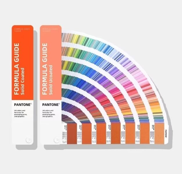
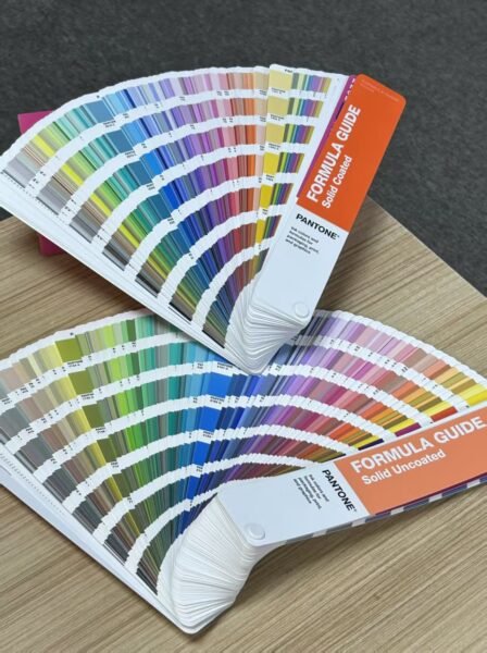
Pantone Palette
What you’re looking at isn’t just a swatch book — this is the Pantone Plus Series Metallics guide. Designers, printers, tanneries, textile mills worldwide all speak the same “color language.” Today we pick three angles that tell you what makes this little fan so powerful.
Why Colors Never Match Between Screen and Print?
You pick a perfect blue on your screen — RGB 0,120,255. Send it to the factory for sampling. You get it back — too green. Adjust. Too purple. Three rounds later, the boss asks: “Why can’t you get one blue right?”
It’s not you. The problem is two color systems speaking different languages:
RGB mode: Red+Green+Blue light
Each channel: 0–256 levels
Same RGB looks different on every screen
CMYK mode: Cyan+Magenta+Yellow+Black ink mix
Affected by paper stock, gloss, lighting
Same CMYK values look different on different materials
So the Pantone fan deck’s purpose is simple: it’s a physical standard. You say “I want Pantone 186 C,” whether you’re in Shanghai or New York, printing on paper or hot-stamping onto leather — hold up the swatch. That exact red.
One Swatch Book Costs Way More Than You’d Guess:
A Pantone Plus Series fan deck typically retails for $100–200 USD. First reaction: “It’s just paper, right?”
It’s not just paper. Each page of swatches is individually coated with a precise ink formula, controlled for thickness, drying process, and gloss calibration. The Metallic series (the one in your photo) is even more special — it uses specialty inks containing actual metal powder, costing 5–10x regular printing ink.
More importantly, Pantone swatch books have an expiration date. Inks fade and oxidize over time, so professional designers replace theirs every 12–18 months. Not a gimmick — a three-year-old color card may already be off.
Fun fact: Pantone’s annual “Color of the Year” (2025 was Mocha Mousse) influences global color trends across fashion, home decor, and product design.
Why Should Leather Crafters Care About a Color Fan?
You make leather notebooks, card holders, wallets — what does printing have to do with anything? A lot.
When a client says “I want this logo in gold foil stamping,” “gold” has a thousand faces. Bright gold? Matte gold? Champagne? Antique bronze? Without a shared language, you and the client will always be on different pages.
Pull out the Pantone fan, flip to the metallics section — “Do you want 871 C (bright gold) or 872 C (dark gold)?” One swatch on the table beats a hundred explanations.
That’s also why in export orders, nearly every brand specifies a Pantone number. It eliminates the “close enough” zone and turns “feels right” into “is right.”
Bottom line: a Pantone swatch book isn’t a tool manual — it’s the Esperanto of the design world. With it, a designer in Shanghai says “186 C” and a factory in Milan produces that exact same red. For the real thing, click the link below~
Feel free to click the link if you’re interested~